Mid-Century Inspired Apartment Renovation
Even though the apartment is the fourth floor of a brownstone, there is a sense of connection to the outdoors because of numerous new skylights and a lush outdoor terrace. The natural material palette was inspired by mid-century finishes like warm wood, creamy white plaster walls, and soft earth tones. The clients came to us having just purchased an apartment on the 4th floor of a brownstone in Cobble Hill. The apartment had not been touched since the 70’s, and it needed a complete architectural refresh. They had a modest renovation budget, a tight timeframe, and an interest in creating a balanced space to relax in when home in Brooklyn.
MAIN LIVING AREA
They travel frequently for work, and had a large collection of souvenirs from all over the world, and they requested ample display space. They love the earthy look of mid-century modern furniture, and had a lot of existing pieces made out of teak and other warm woods, and they asked us to design a space that felt current, but that would work well with their collection.
SUNNY LIVING ROOM
HIDDEN CABINET FOR TV
The material palette was chosen specifically to look handsome with mid-century materials. Rather than trying to design in the past, we agreed on choosing finishes with the spirit of that time, but with more simple, minimal detailing. There are various warm wood tones, earthy neutrals, and rich but understated textures.
SAGE ENTRANCE AREA
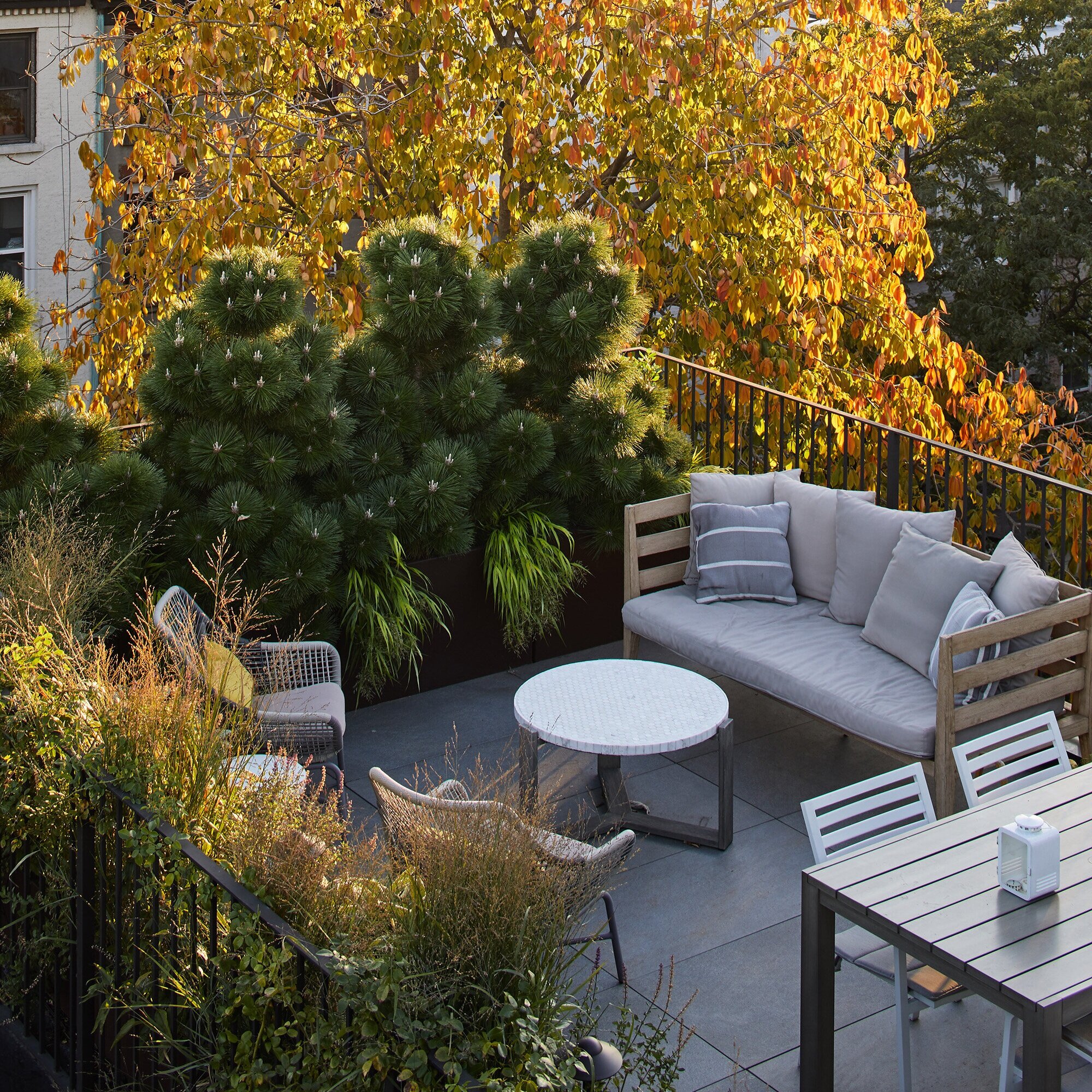
LUSH ROOF TERRACE GARDEN
One of the features of the apartment was a small outdoor terrace, which is on the roof of an extension beneath. This gave us the opportunity to create the feeling of connection to the outdoors, even though the apartment is so far above the ground. The clients wanted a bright, happy space, so we added a number of key skylights to the design, to add soft ambient daylighting.
OPEN SHELVING WITH DECORATIVE PLASTER FINISH
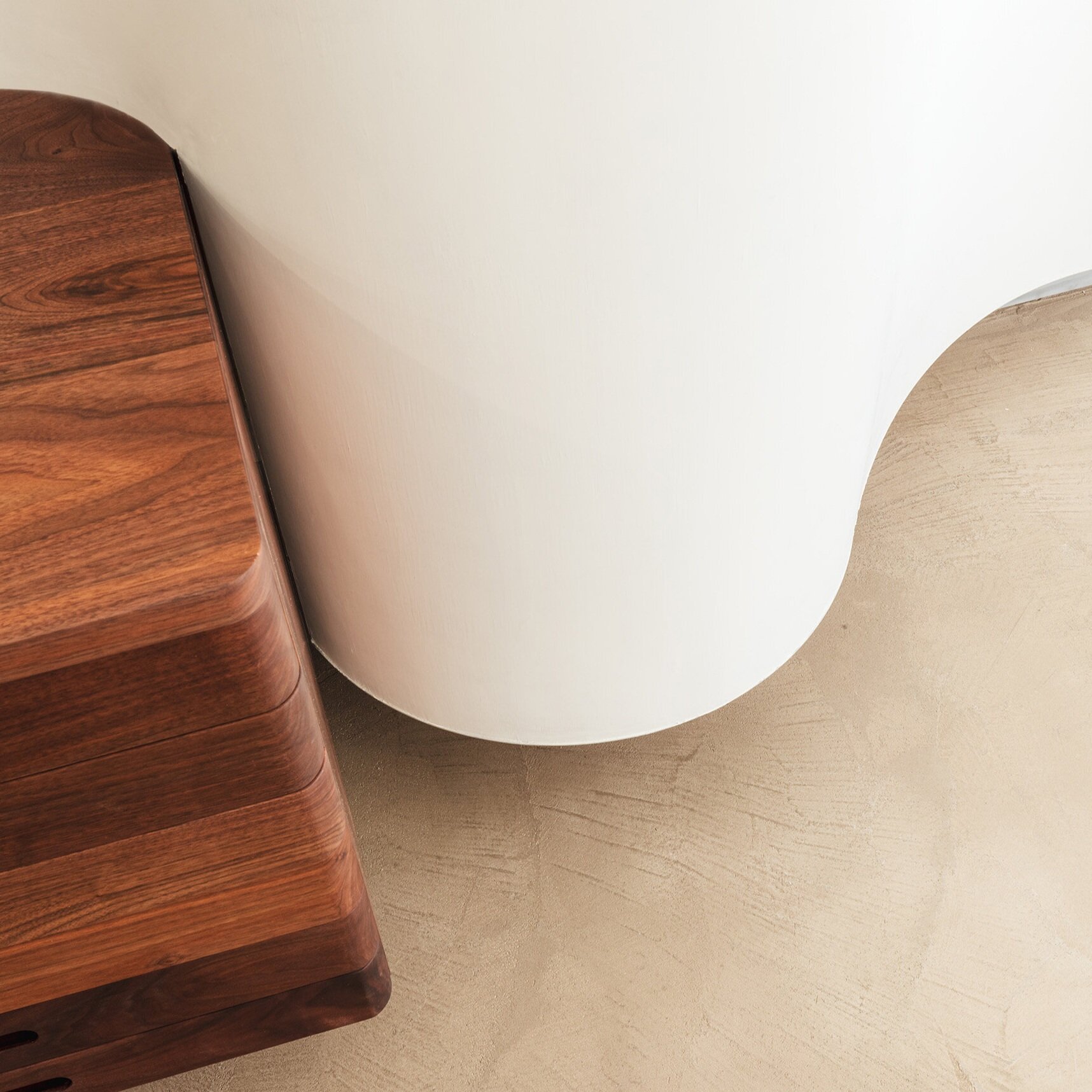
One unusual feature of the apartment was that the windows at the front of the building, facing the street, were almost 5’ above the floor level when they bought the apartment, so it was impossible to see anything outside except the sky. To make this less jarring, we introduced a change in level between the bedroom area and the entertaining spaces. There are two steps that line up with the kitchen millwork, so we designed some curving shelves to soften this transition.
HIDDEN WINE FRIDGE
DIRECT SUNLIGHT IN THE KITCHEN
In its final form, it feels much more natural, and the change in level feels purposeful and designed. Additionally, it allowed us a lot more flexibility in relocating plumbing fixtures, since the waste pipes could be rerouted in the space beneath the new raised floor.
WALNUT KITCHEN CABINETRY WITH DISAPPEARING UPPER CABINETS
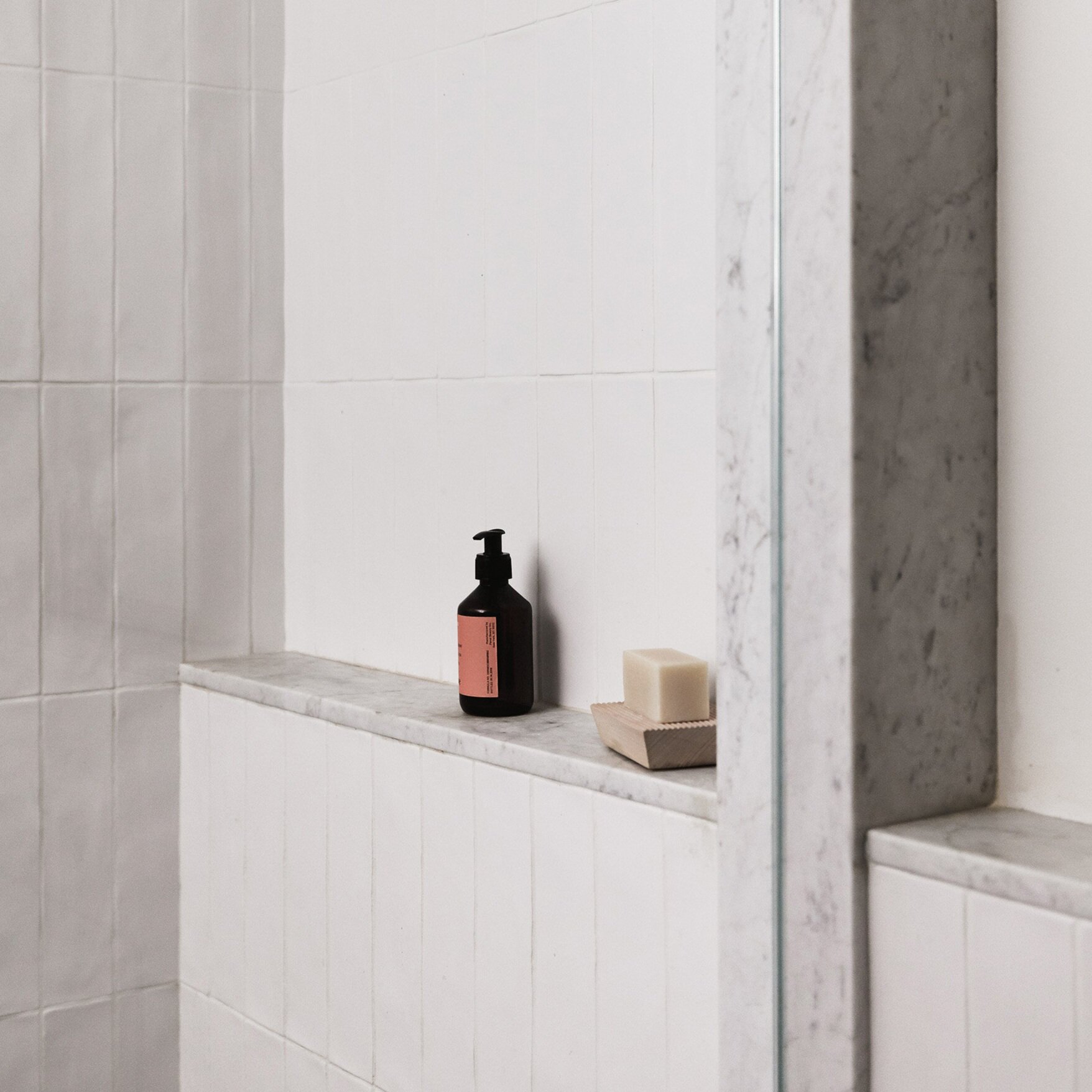
The renovation budget was modest, so many choices were made based on what was most cost effective but still sophisticated. The stone tile in the entry way and the bathroom is basalt, which is a volcanic stone that is widely available and inexpensive. The flooring is Douglas-fir, which is uncommon yet not expensive. The kitchen countertop stone was a lucky find; we sourced two leftover slabs that our stone supplier had been sitting on for several years. Our stone yard was happy to let them go for a discount.
FIOR DI BOSCO
TADELAKT SINK, BUILT ON SITE
GRACIOUS SHOWER WITH A LARGE SKYLIGHT
In responding to the client’s concerns for their last apartment quickly looking tired and worn out, we recommended using natural materials, instead of engineered counterparts. We strongly believe that by using solid hardwoods and natural stones, the finishes age more gracefully and can look well-loved rather than worn-out as time passes.
CUSTOM LIMESTONE SINK


